The blog

Maybe you've invested in a logo, selected a color palette, chosen a few fonts, and built a beautiful website. On the surface, everything feels cohesive. But if your brand still isn't attracting the right audience, feels inconsistent across touchpoints, or never quite communicates what makes you different, the issue may not be the design itself.
That's because a visual identity isn't a collection of assets. It's a system. Every design decision should reinforce the same story, emotion, and perspective. Strong brand identity design begins long before colors or typography are selected, and when that strategic foundation is missing, even the most aesthetically pleasing visual identity can feel disconnected. Here's how to recognize the signs and what a truly effective identity is doing behind the scenes.
5 Signs Your Visual Identity Isn't Working
One of the biggest misconceptions about branding is that if something looks good, it's working. In reality, the strongest visual identities aren't simply attractive; they're aligned. Every decision has a reason behind it.
So how can you tell when something feels off?
1. You're following trends instead of your own point of view.
Trends can be useful for understanding where design is headed, but they shouldn't become the foundation of your brand. When visual decisions are driven by what's popular instead of what genuinely reflects your business, the result often feels interchangeable.
As Isla Luna Studio co-founder and chief creative officer Kayle Schlesner explains, "When a brand is chasing trends instead of staying rooted in who they are, you can feel it. Nothing feels cohesive because every decision is reacting to what's working for someone else."
The goal isn't to ignore trends entirely. It's to filter them through your own perspective rather than building your identity around someone else's success.
2. Personal preference has replaced strategy.
It's natural for founders to have favorite colors, fonts, or aesthetics. After all, you've likely spent years thinking about your business before bringing in a creative partner.
But effective branding isn't about designing for yourself. Instead, every decision should support the audience you're trying to reach and the feeling you want them to experience. A sophisticated serif font, for example, communicates something very different than a rounded sans serif. Neither is inherently better; they simply tell different stories.
When choices are driven primarily by personal taste instead of strategic intent, the identity begins serving the founder instead of the customer.
3. Nothing feels consistently connected.
Inconsistency is often one of the easiest signs to spot. Maybe a new color appears on social media that doesn't exist anywhere else, typography shifts from page to page, or every marketing piece feels like it belongs to a different brand.
“A brand is more than your logo, colors, and typography,” Kayle explains. “It's how all of those elements work together as a system and how they're consistently brought to life across every touchpoint."
That's where thoughtful brand guidelines become essential. Rather than limiting creativity, they create a shared framework for applying your visual identity consistently, whether you're designing a social post, launching a new product, or updating your website. The result is a brand that feels recognizable no matter where someone encounters it.
4. The design isn't easy to navigate.
Sometimes the issue isn't aesthetics at all; it's usability. This could manifest as typography that's difficult to read, line spacing that's too tight, low color contrast, headlines competing for attention instead of creating hierarchy, or messaging that tries to say everything at once.
These are visual identity decisions just as much as logos and colors are. A strong identity doesn't simply create a mood; it helps people understand your business quickly and confidently. When information feels effortless to absorb, trust follows naturally.
5. Your messaging and visuals don't sound like the same brand.
Even beautiful design can feel disconnected if the messaging tells a different story. Perhaps the visuals communicate refinement while the copy feels overly casual, or the design feels playful, but every headline reads like corporate jargon. Neither is necessarily wrong on its own, but together they create a disconnect.
Your visual identity and brand voice should reinforce one another. When both are working toward the same emotional experience, the brand feels believable.
What a Strong Visual Identity Is Actually Doing
A visual identity doesn't come together because the right colors, typography, or logo were chosen. Those elements only become meaningful when they're rooted in a clear understanding of the business itself, giving every design decision a purpose instead of leaving it up to personal preference or passing trends.
That's why we spend as much time learning about the founder and the story behind the business as we do designing the identity itself.
"We give extensive brand questionnaires that ask a lot of targeted questions to get the founder to start talking and expanding more about their why and the reason that they are creating their product or service," as Kayle explains. Those conversations don't just inform the creative process; they become the strategic foundation that shapes every decision moving forward.
Typography sets the emotional tone
Typography does much more than make a brand legible. It helps shape the first impression, communicating something about a brand's personality before a customer has read a single word. A classic typeface might evoke a sense of refinement and timelessness, while something softer and more rounded can feel warm, approachable, and inviting. Neither choice is inherently better than the other; what matters is choosing typography that reflects the experience you want your audience to have.
"We're making sure that the look and feel of the typography is emulating that emotion that we want to convey," Kayle says.

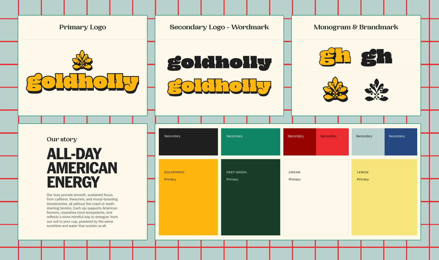
Your logo should reinforce, not compete with, the rest of the identity.
A logo is often someone's first interaction with your business, but it shouldn't exist in isolation.
Every subtle decision — from weight and proportion to rounded corners or sharper geometry — should support the same emotional direction established through typography and color. Rather than treating the logo as the entire brand, we think of it as one part of a larger system. It should feel completely at home alongside every other visual element.
Digital experiences should continue the same conversation.
A website is made up of hundreds of seemingly small decisions: the shape of a button, the way information is organized on a page, the tone of a call to action that nudges someone toward their next step.page. On their own, those details may not feel especially significant. But together, they shape how a brand is experienced.
An identity rooted in an elevated, editorial aesthetic should carry that same feeling through every interaction, and a more playful or approachable brand should feel just as consistent in the way its digital touchpoints are designed. As Kayle explains, “it's these subtle details that build the emotional throughline we want for the strategy as a whole.” "build up together to create that same emotion that we're leaning towards for the overall strategy."

Physical touchpoints matter just as much.
A visual identity doesn't stop at your website. Every interaction someone has with your brand should feel like part of the same experience, whether they're scrolling through your homepage or holding your product in their hands.
Even seemingly small decisions — like whether packaging feels soft and rounded or clean and structured — help reinforce the story your brand is telling. When every touchpoint supports the same feeling, the identity becomes stronger and more memorable.
That's what transforms a visual identity from a collection of assets into a recognizable brand. Instead of every touchpoint feeling like it was designed independently, each one builds on the last, creating an experience that feels familiar, cohesive, and unmistakably yours.

Why Strategy-First Identities Feel Stronger
If you've ever looked at a brand and thought, they just know who they are, you're responding to something much deeper than the visuals themselves. The strongest identities are rooted in a clear strategy, giving every creative decision a purpose beyond simply looking good.
"The strength is in the conceptual work behind the brand. The copy is going to be better and more clear. The design is going to have more meaning to it. There's going to be more of a story behind what you're actually seeing," Kayle explains.

Rather than limiting creativity, that foundation gives it direction. When there's a clear concept to build from, every decision becomes more intentional and ideas come more naturally. "It sparks a lot better ideas when you have an actual concept and strategy behind what you're designing and creating," Kayle says.
The result is a brand that feels more distinctive, more cohesive, and more confident because every element is working toward the same goal. Customers may not be able to articulate why one brand stands out over another, but they recognize when something feels intentional. That consistency builds familiarity, trust, and ultimately a stronger connection with the people you're trying to reach.

How Isla Luna Studio Approaches Visual Identity
At Isla Luna Studio, we begin by understanding a brand’s strategy before diving into the nitty gritty of its visual identity.
Our discovery process is designed to uncover far more than aesthetic preferences. Through questionnaires and founder conversations, we explore what inspired the business, who it's meant to serve, and how it should make people feel. Those early conversations aren't a box to check before the creative work begins; they are the creative direction.
From there, every visual decision has a purpose.

Typography, color, illustration, photography direction, digital interactions, packaging recommendations, and brand guidelines are all developed as parts of the same system, not as individual deliverables. Each element should reinforce the next, creating an identity that's recognizable whether someone discovers your brand through Instagram, visits your website, opens your packaging, or encounters you somewhere entirely new.
If you're beginning to notice places where your own brand feels disconnected, that's not necessarily a sign that you need to start over. More often, it's an opportunity to step back, reconnect with the strategy underneath your business, and build a stronger foundation from there.
If you're curious about how we approach brand identity design, you can browse our services, explore our expertise across health and wellness, fashion and beauty, food and beverage, and travel and lifestyle, or see our case studies to learn how these systems come to life. And if you're ready to talk through your own brand, we'd love to connect.
Start your project with us today.

Looking to fall down more rabbit holes?
Related Articles

Isla Luna Studio BTS: The Tools That Keep Us Running
Every studio has its own operating system — not just creatively, but practically too. The platforms quietly holding together timelines, concepts, client communication, internal workflows, feedback rounds, strategy development, content planning, and everything in between.
Good things, straight to your inbox
Stay in the loop on Isla Luna Studio news, a peek behind the scenes, and more.
