Goldholly
Goldholly partnered with Isla Luna Studio to redesign the packaging system for its regenerative Yaupon tea line. Built around North America’s only naturally caffeinated plant, the brand was founded with the goal of introducing consumers to a more grounded, sustainable way to energize. Isla Luna Studio was brought in to create a packaging experience that could better communicate the uniqueness of the product while positioning Goldholly alongside a new generation of elevated wellness and beverage brands. The result was a visual direction that feels playful, polished, and distinctly American — balancing nostalgia, clarity, and modern shelf appeal.
The Challenge
Yaupon tea brand Goldholly had a genuinely extraordinary product, but the visuals weren't telling the brand story. The existing packaging and visual identity were outdated, and there was nearly no education built into the brand to help consumers understand what Yaupon even is. For a product built around an unfamiliar tea leaf with a compelling origin story, that gap wasn't just a design problem; it was a business problem.
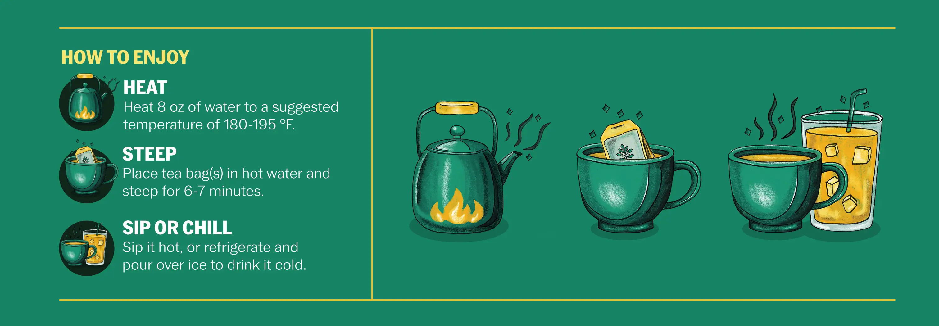
The packaging needed to work harder: communicate clearly what the product is, educate curious customers on the benefits of Yaupon, and do so with a polished visual identity that earns its place on a shelf alongside established tea and wellness brands. The brand had real potential — it just needed a creative direction bold enough to unlock it.

Our Impact
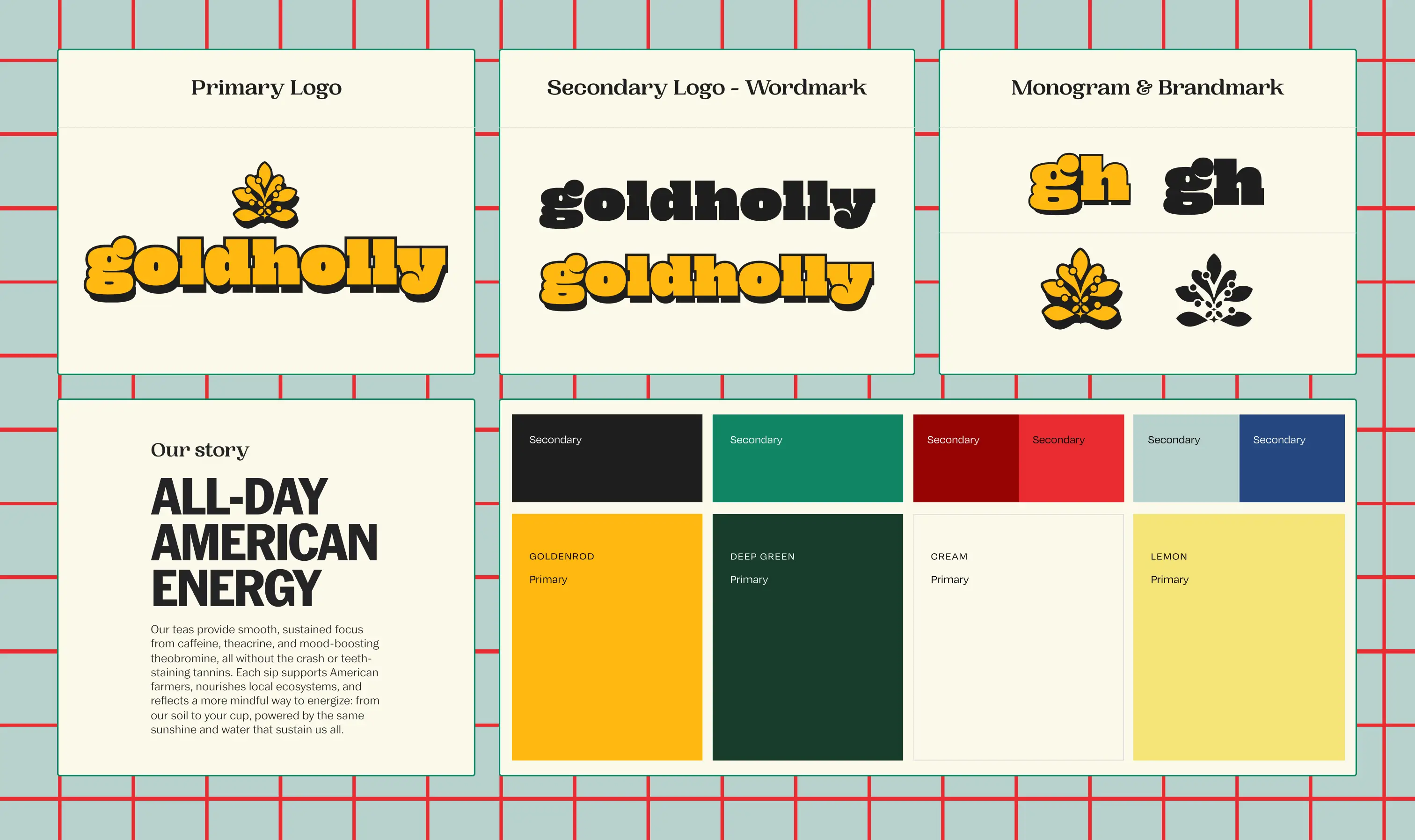
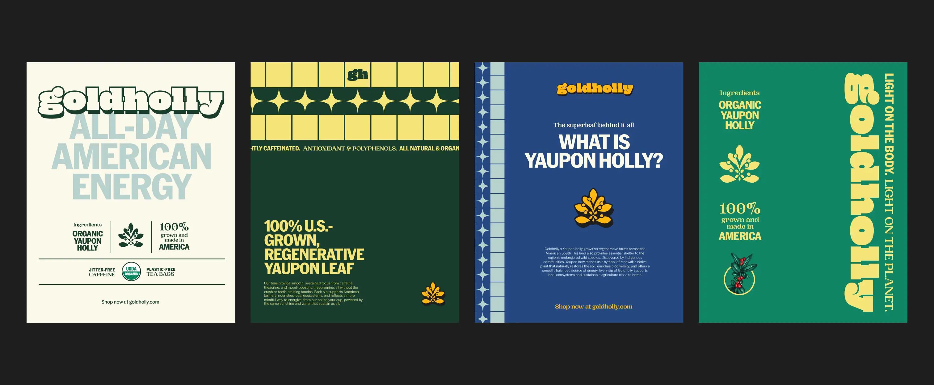
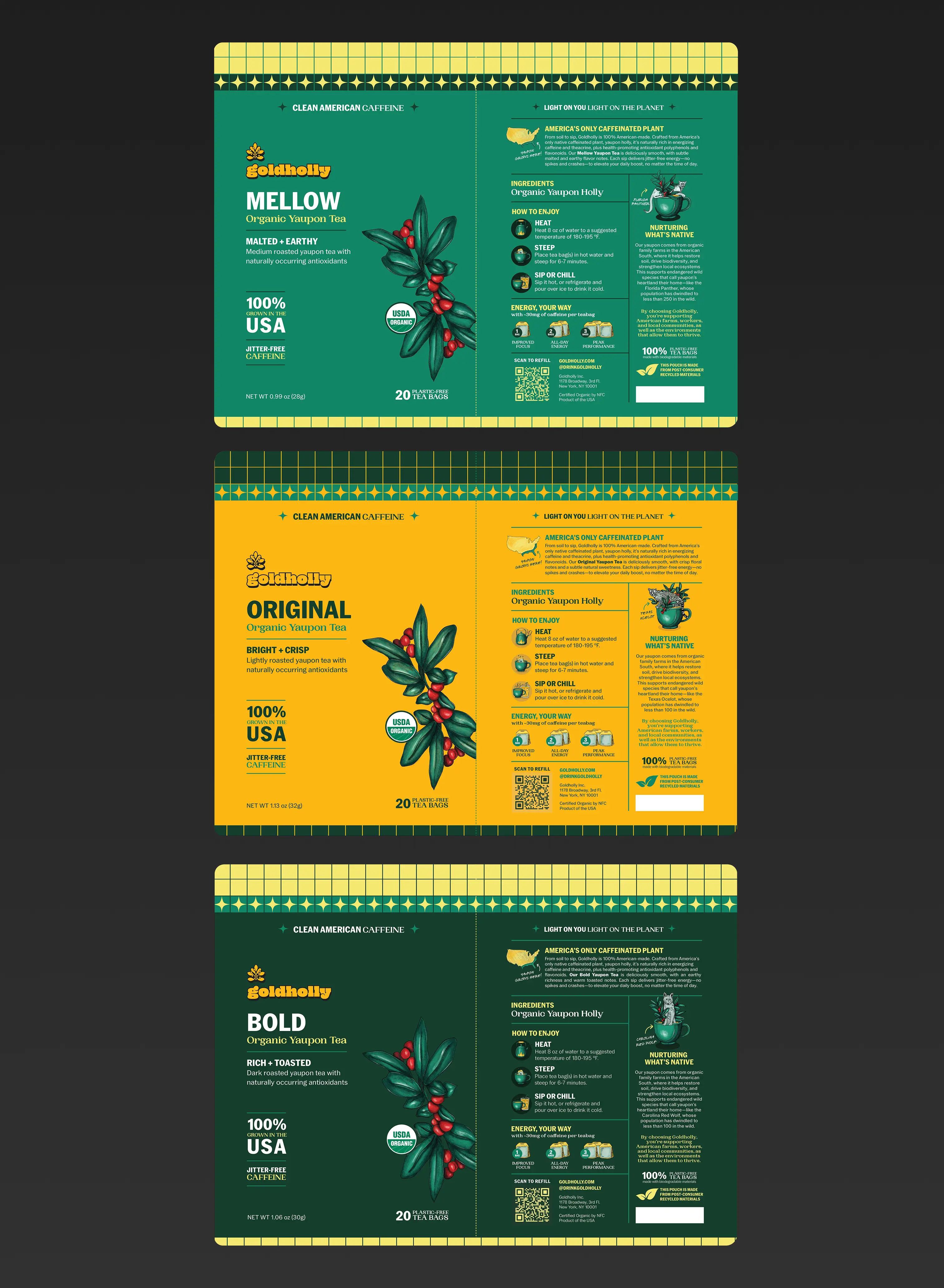
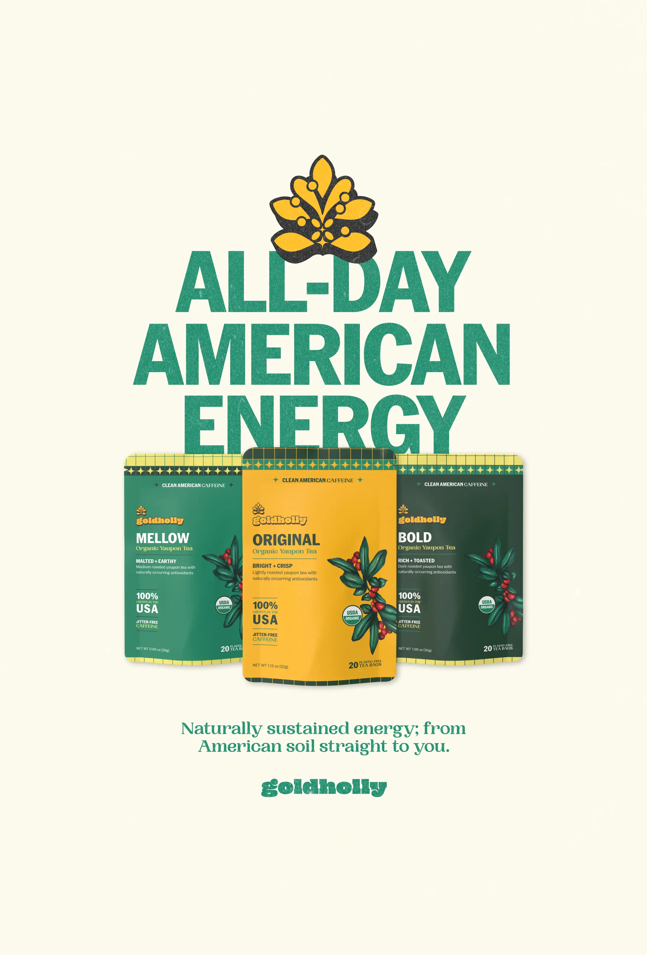
Isla Luna Studio led a comprehensive packaging and brand identity overhaul for Goldholly across their full product line. Our scope of services included a creative direction overview, packaging moodboard, typography exploration, color palette refinement, illustration style direction, and guidance on the animal motifs and leaf imagery central to the brand's identity.
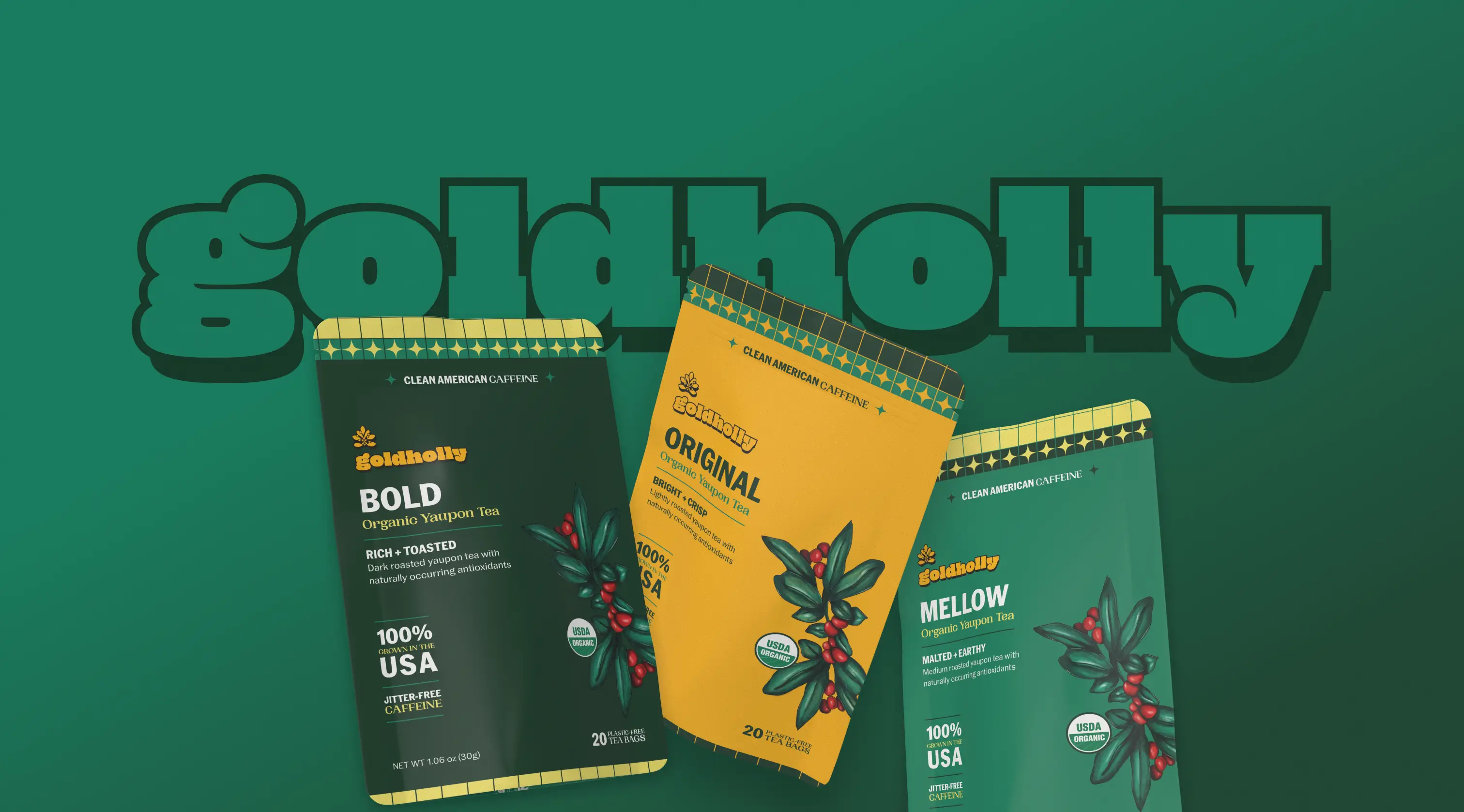
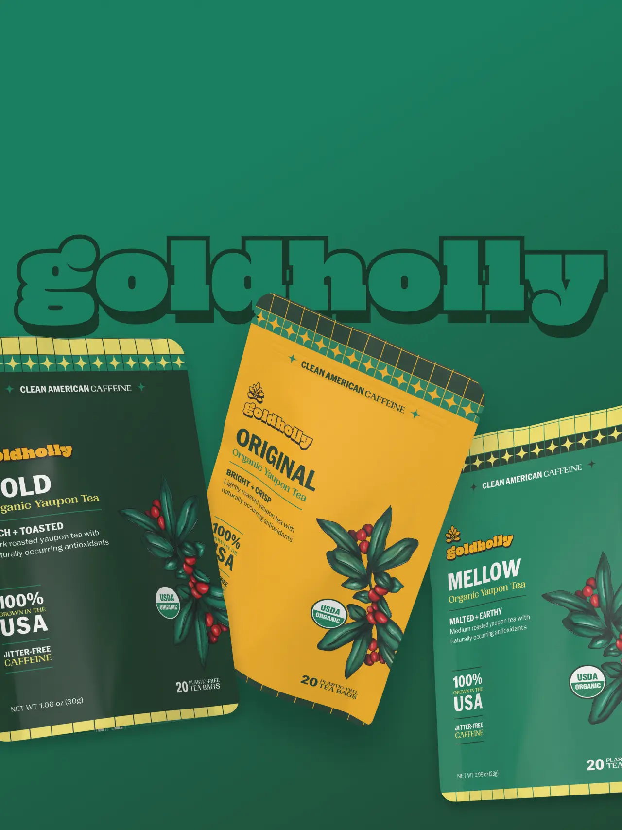
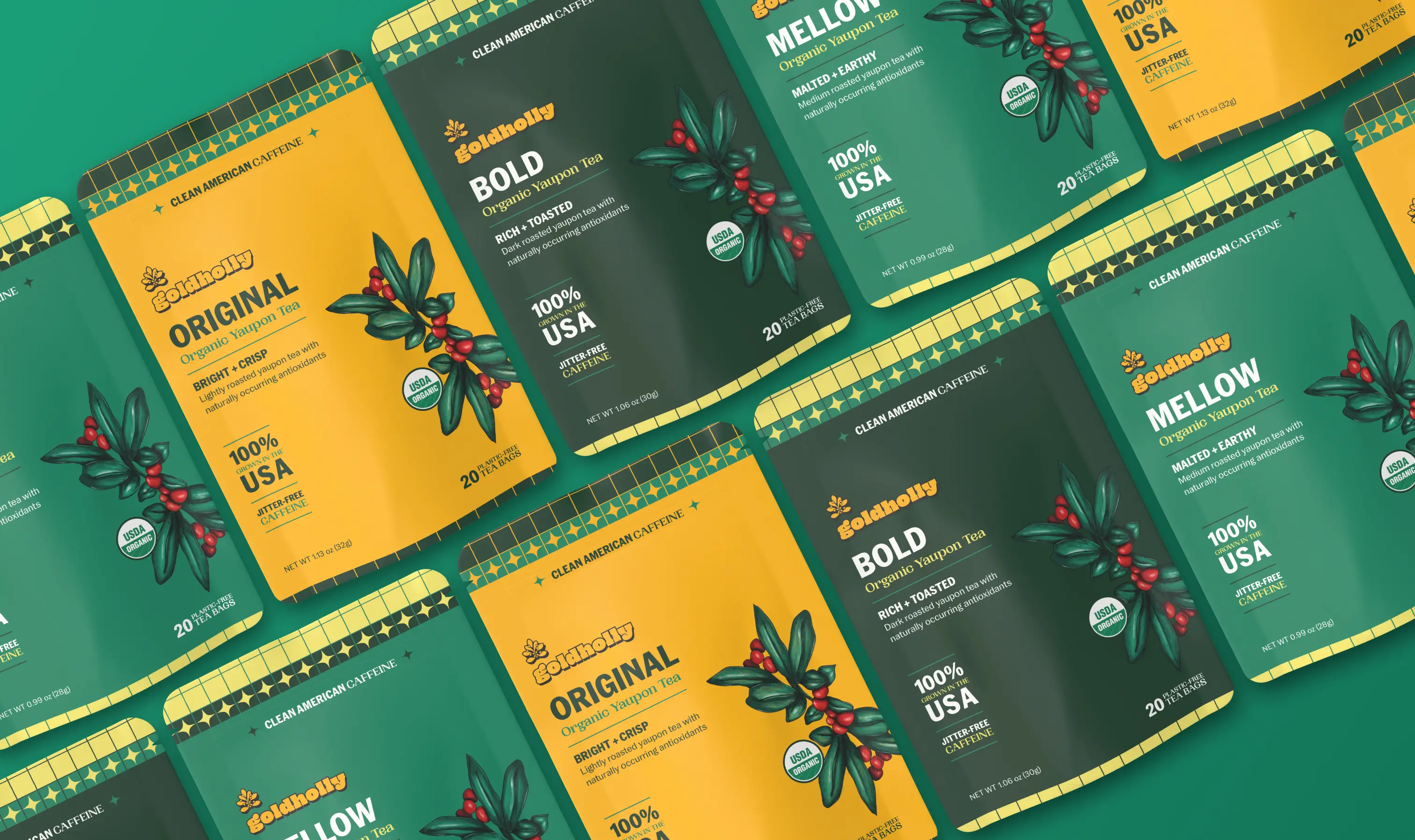
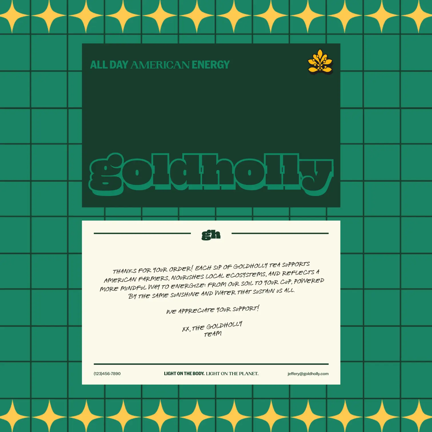
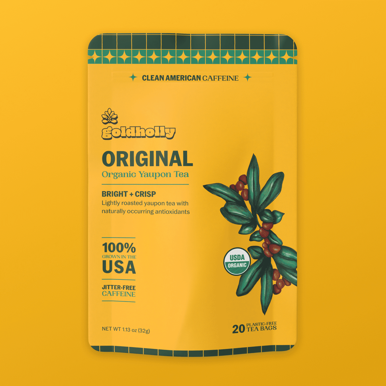
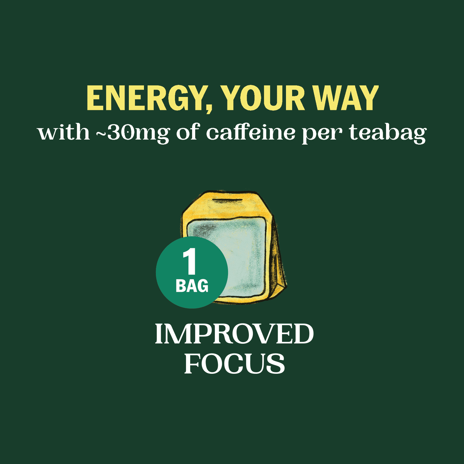
From there we moved into execution — reimagining the illustration style, refining brand copy and hierarchy, and designing both the individual tea pack envelopes and retail cartons for all three SKUs: Light, Medium, and Dark. A variety pack was also developed as a recommendation to support sampling and gifting. Every surface was treated as an opportunity to educate, delight, and convert.
Building the Brand
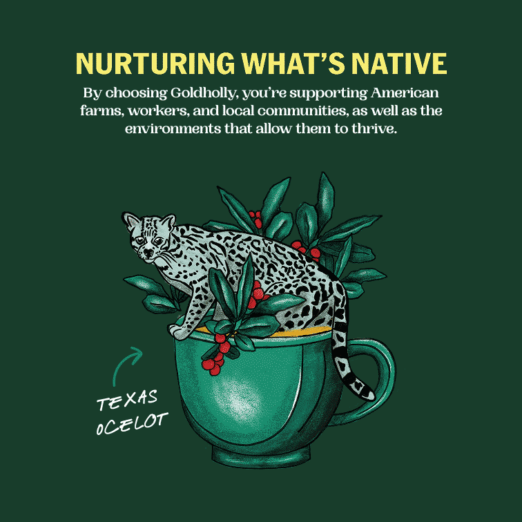
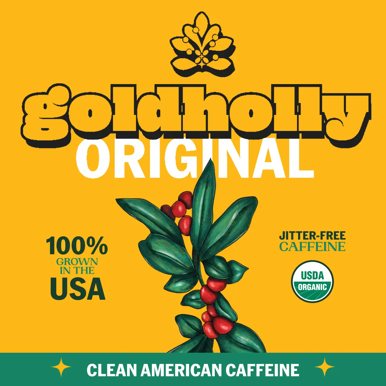
The creative direction for Goldholly is playful Americana — a visual language drawn from mid-century American diner graphics and vintage cartoon mascots, reinterpreted through a clean, contemporary lens. Nostalgic warmth meets modern clarity. Friendly but never kitschy. Approachable yet polished.
The retro tone nods to tradition and authenticity, grounding Goldholly in something familiar even as it introduces something entirely new. The modern polish communicates credibility, sustainability, and genuine design sensibility, signaling that this is a brand worth trusting. And the playful illustration style captures the warmth and energy of a caffeinated beverage without borrowing a single note from the loud, aggressive world of energy drink branding.
The color palette — orange, yellow, green, and black with pops of red and blue — was built to work both as a cohesive system and a differentiator across SKUs, giving each variety its own personality while keeping the full lineup instantly recognizable as Goldholly. Animal motifs and a reimagined Yaupon leaf illustration bring the brand's story to life visually, giving customers something to discover and connect with every time they reach for a pack.
Designing Refreshed Packaging
With this new packaging, Goldholly is entering its next growth stage in the food and beverage industry with the tools and confidence to scale. Goldholly continues to raise capital and expand its e-commerce presence, now backed by a brand identity that can hold its own in any room — whether that's a retail shelf, an investor pitch, or a customer's morning routine. What was once a product struggling to explain itself has become a brand people are genuinely excited to discover.
Related Projects
Good things, straight to your inbox
Stay in the loop on Isla Luna Studio news, a peek behind the scenes, and more.