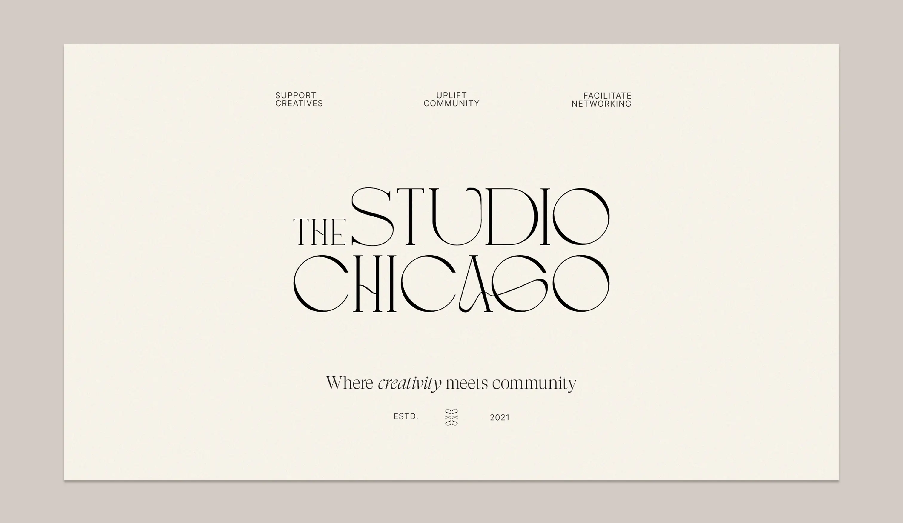
The Studio Chicago
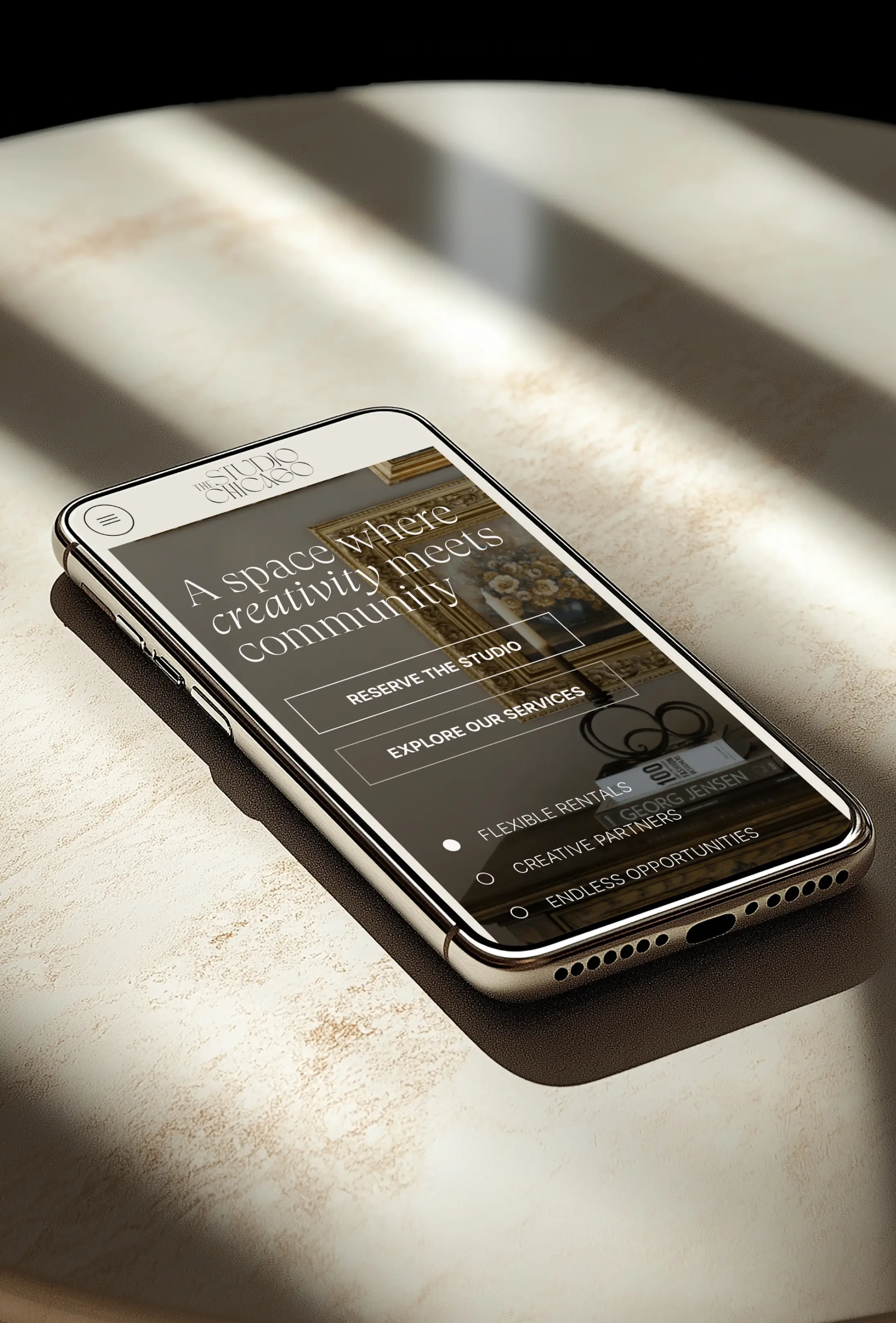
The Studio Chicago has become one of the city’s leading daylight studio rentals and creative production spaces, bringing together entrepreneurs, brands, and artists under one thoughtfully designed roof. As the business expanded beyond studio rentals into a broader creative ecosystem, the brand needed a digital presence that could more clearly communicate the full scope of its offerings and the caliber of work behind them. Isla Luna Studio led a strategic website and brand uplevel designed to position The Studio Chicago as both a premier rental destination and a trusted creative partner. The result was a more refined and cohesive online experience that feels elevated, versatile, and deeply connected to the creative community it serves.
Location
Chicago, IL
Project Scope
Brand Strategy
Visual Identity
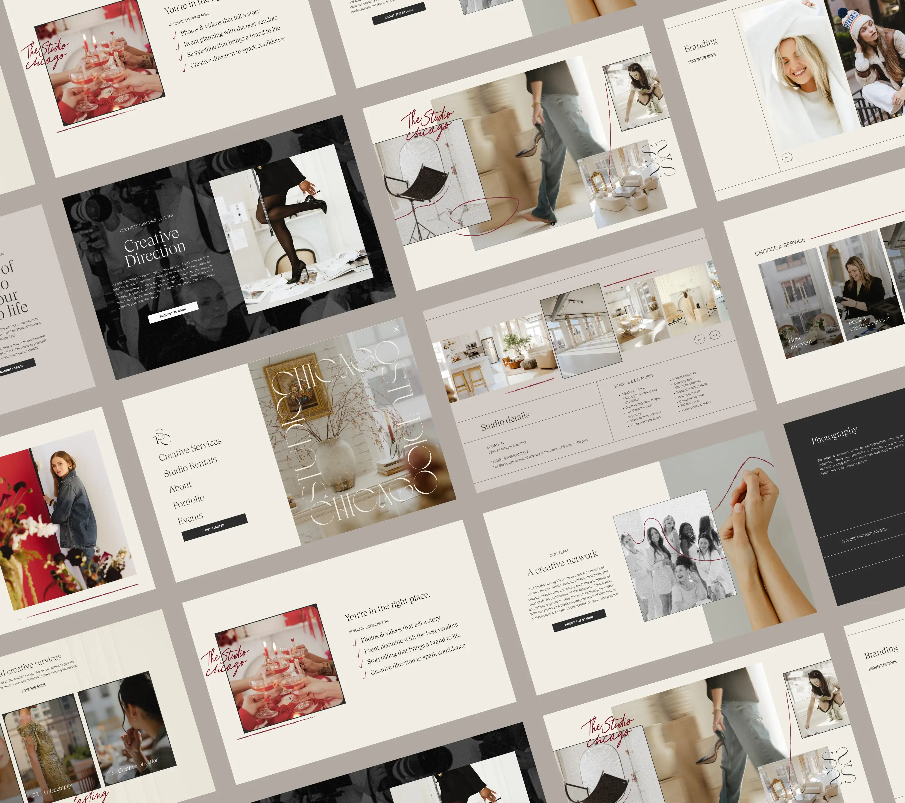
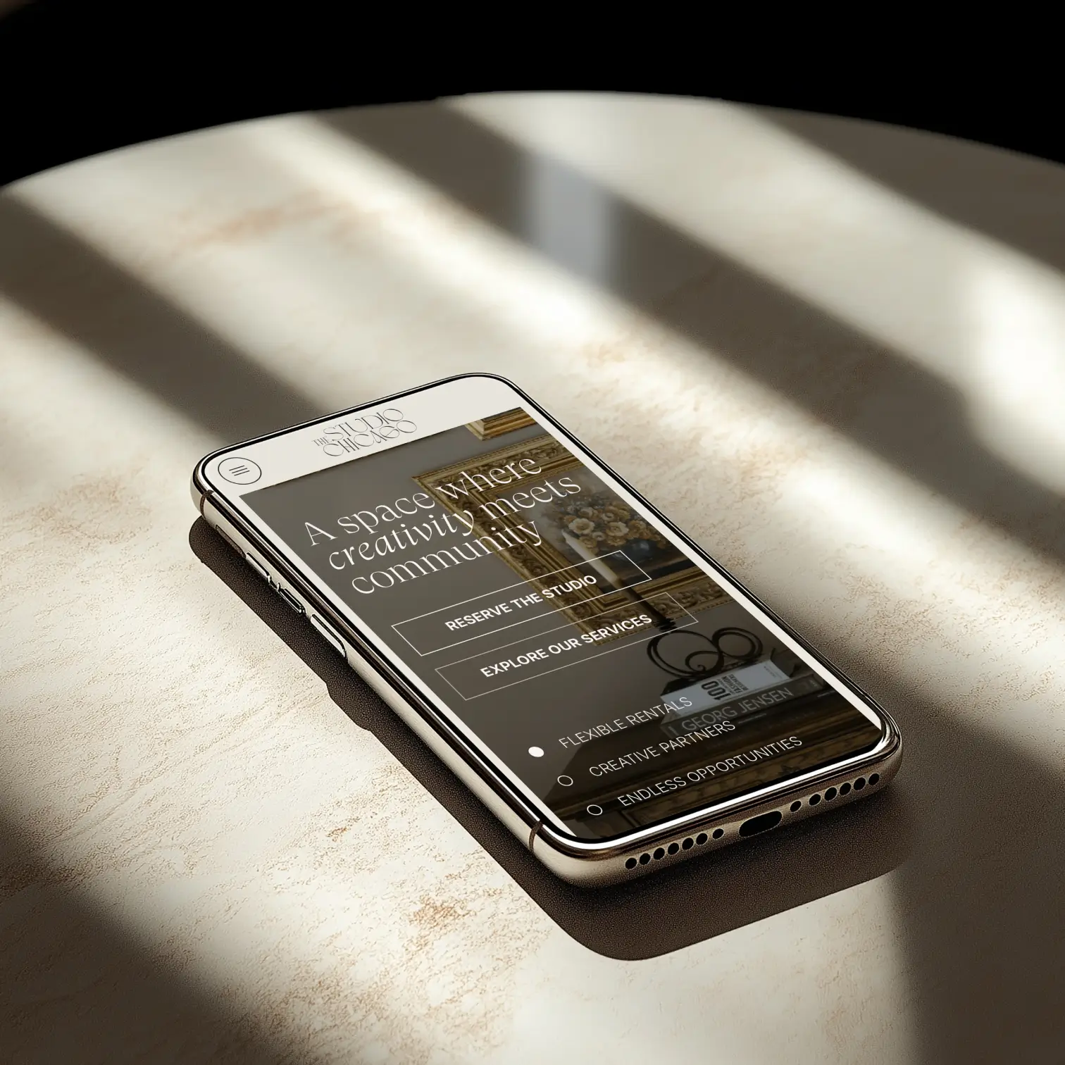
Website UX/UI
Social Templates
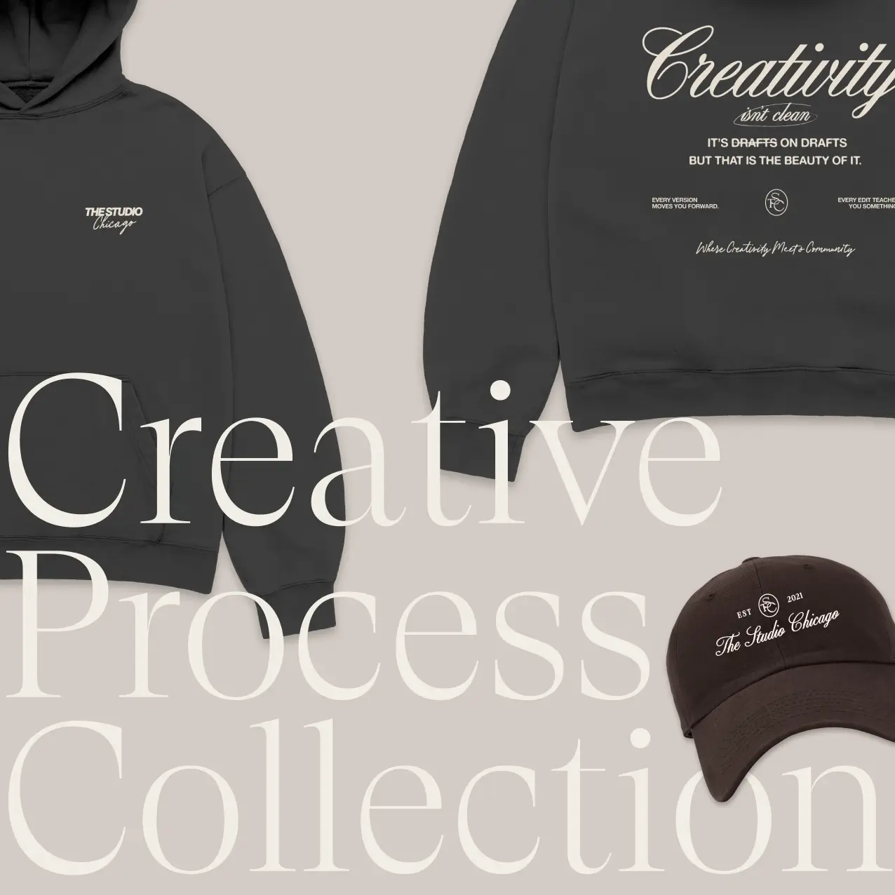
Merchandise Design
The Challenge
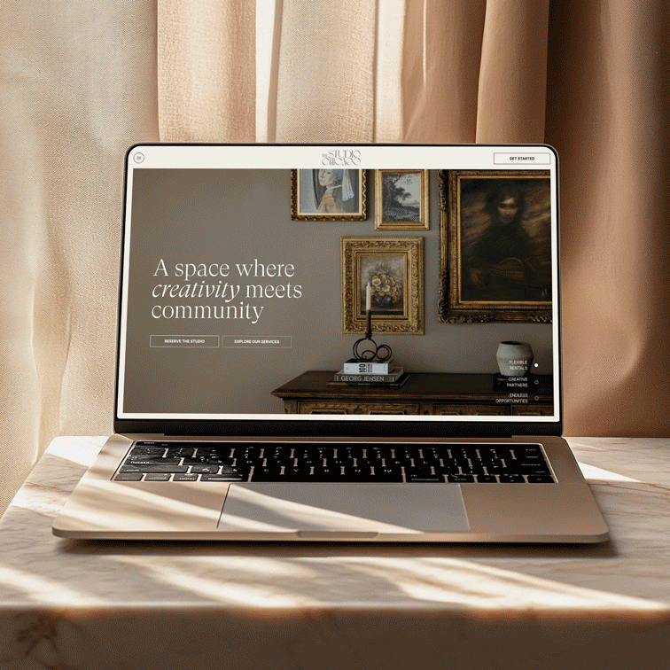
The Studio Chicago wasn't broken, but it was ready to grow. The business had expanded its offerings, built out a talented team, and established itself as a genuine creative destination in Chicago. But the website hadn't kept pace. It wasn't fully communicating the range of what The Studio Chicago could do, and first-time visitors couldn't always tell at a glance whether they were looking at a studio rental, a creative agency, or both.
The answer, of course, is both. And the website needed to say so clearly, confidently, and beautifully. As the business scaled, the digital presence needed to match — more professional, more streamlined, and more representative of the caliber of work happening inside those walls.

Our Impact
Isla Luna Studio led a comprehensive brand audit and website uplevel for The Studio Chicago, delivering a signature website redesign, full UX/UI design, brand strategy, and foundational SEO. The engagement also includes seasonal consultations and updates — an ongoing partnership that ensures the brand continues to evolve alongside the business.
The goal was clear: more professionalism, more clarity, and a seamless user experience that communicates everything The Studio Chicago offers from the moment someone lands on the page.
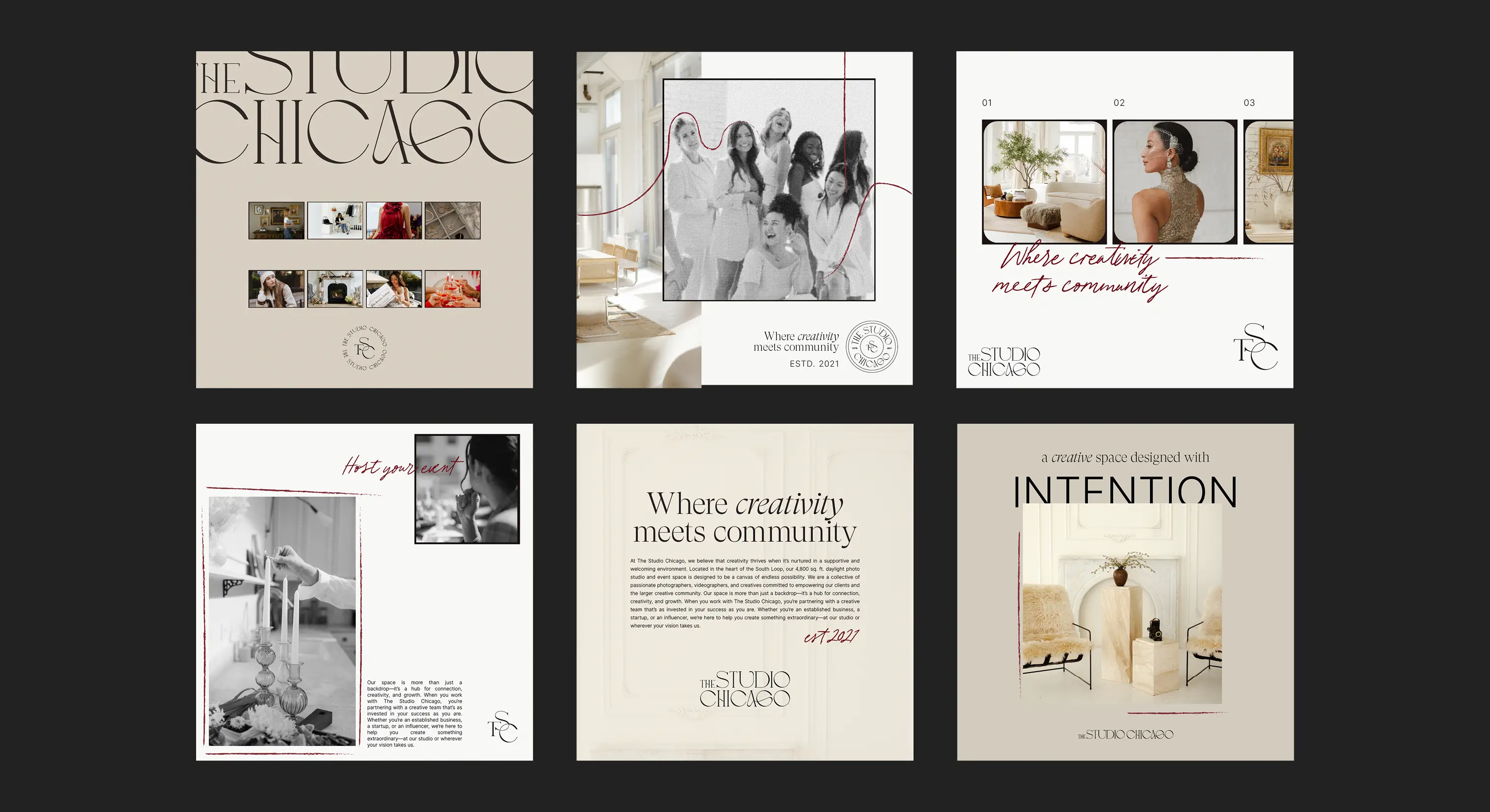
Building the Brand
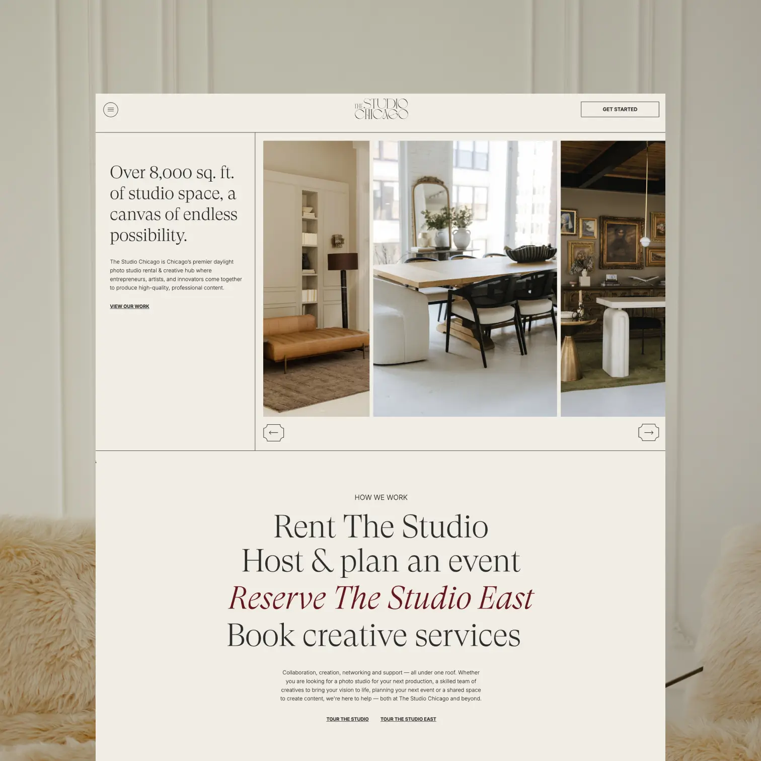
The creative direction for The Studio Chicago's uplevel was guided by a single balance: mature and sleek, but warm and inviting. The brand needed to feel sophisticated enough to attract established businesses and serious creatives, while remaining approachable enough to welcome the first-time entrepreneur who's just found their footing.
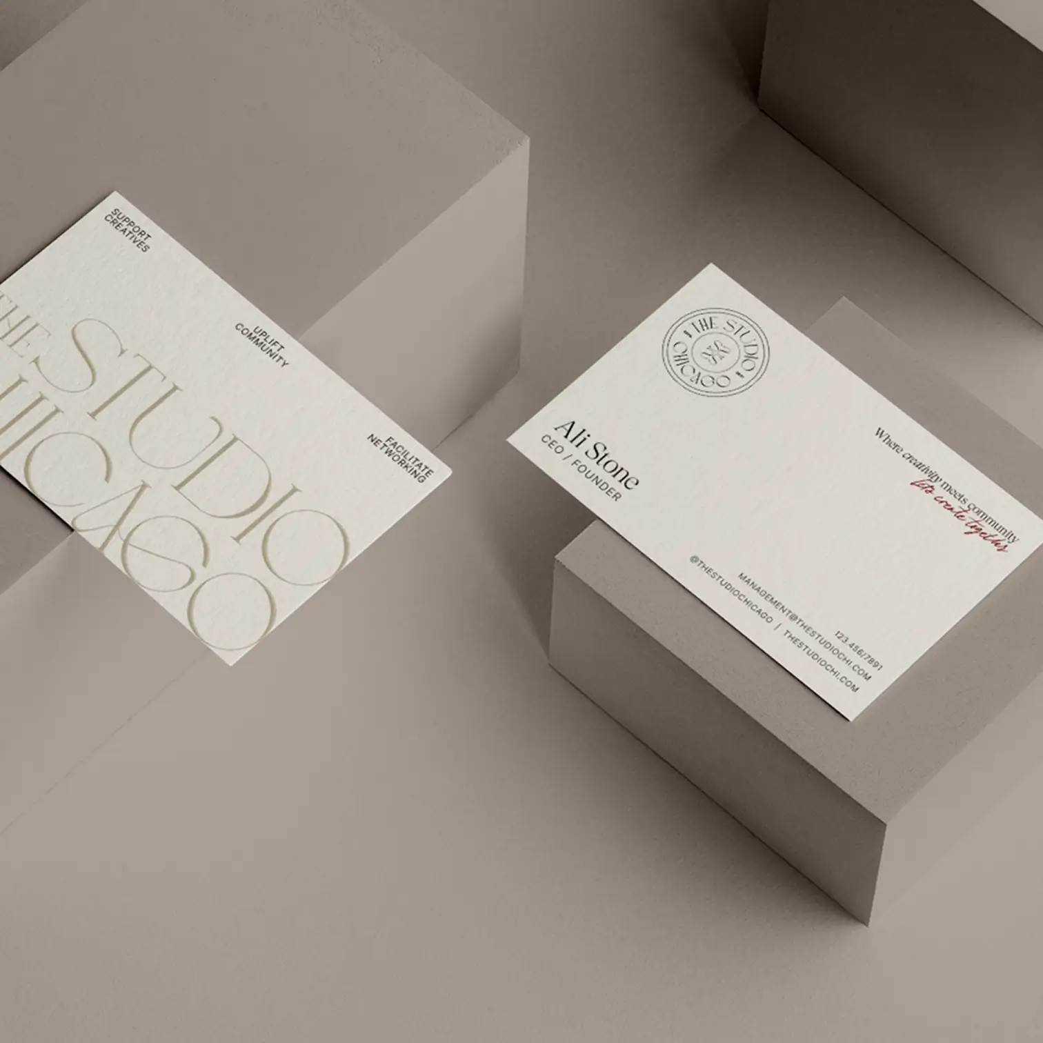
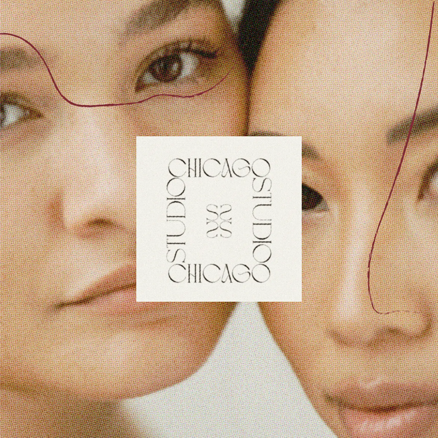
The logo was designed to feel fluid and natural, paired with structured, clean typography that grounds the identity in confidence and clarity. Across the full type system, a balance of italic accents and varied font weights adds interest and edge without sacrificing warmth — sophisticated and luxurious, but never cold.
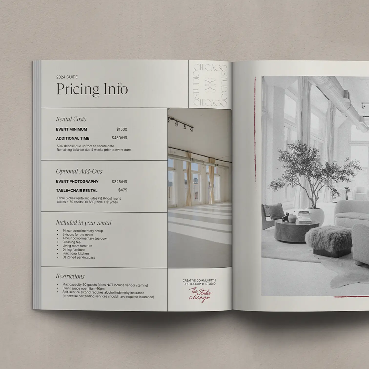
The color palette is built around neutrality as a feature, not a fallback. A dominant neutral palette mirrors the studio itself — a true blank canvas that can become anything for any brand. Pops of deep red introduce energy and personality, keeping the experience engaging and human. Hand-drawn and grid-like elements woven throughout the brand represent the underlying theme of connectivity — the thread that runs through everything The Studio Chicago does.
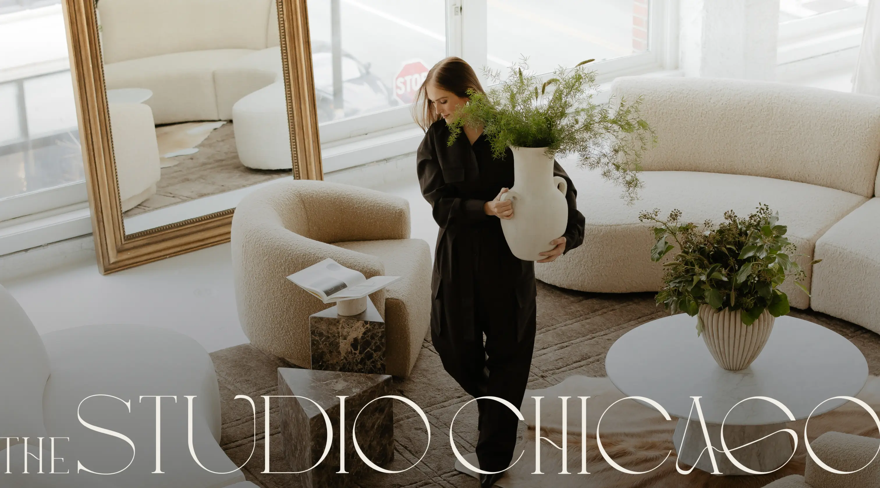
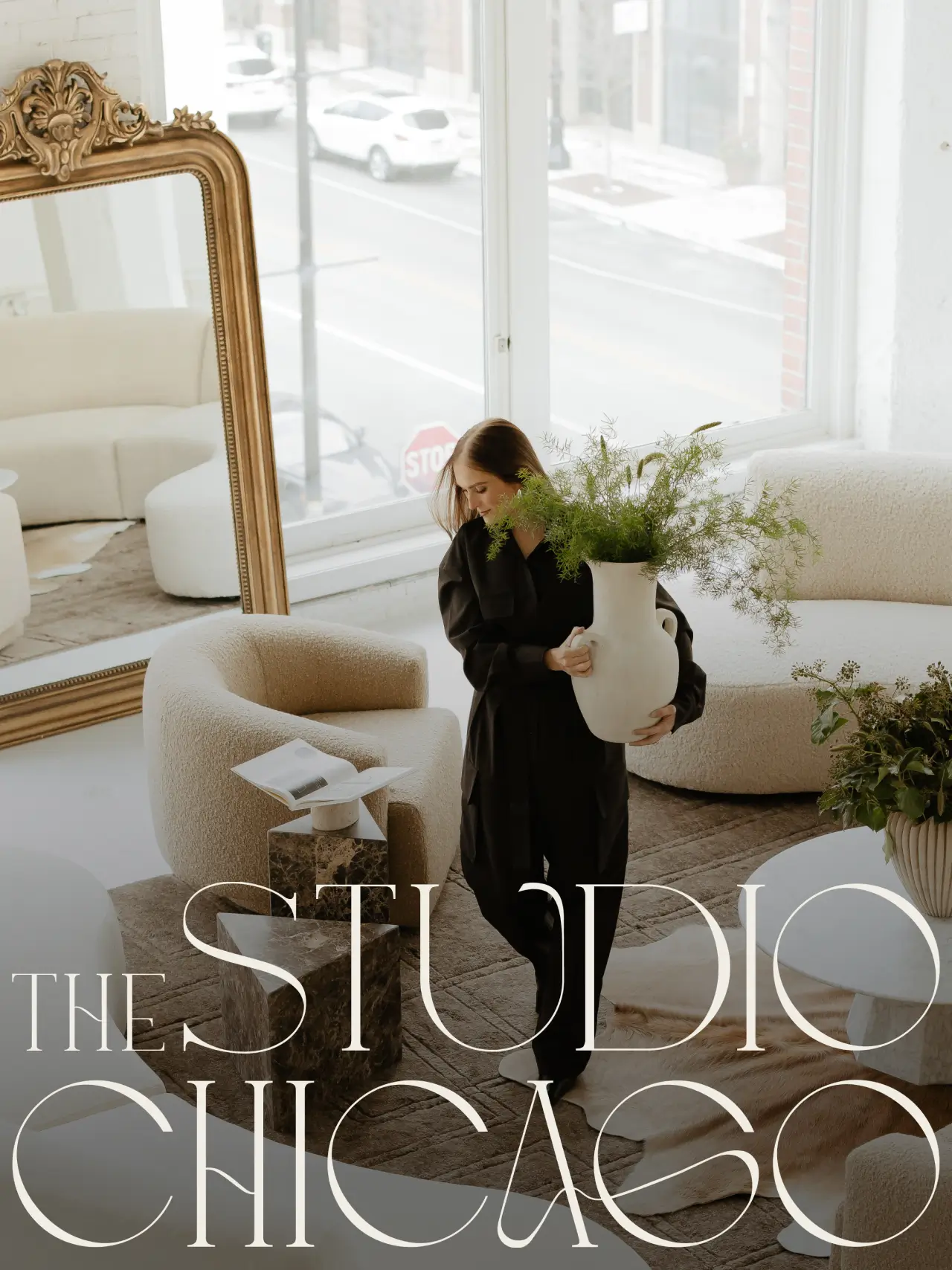
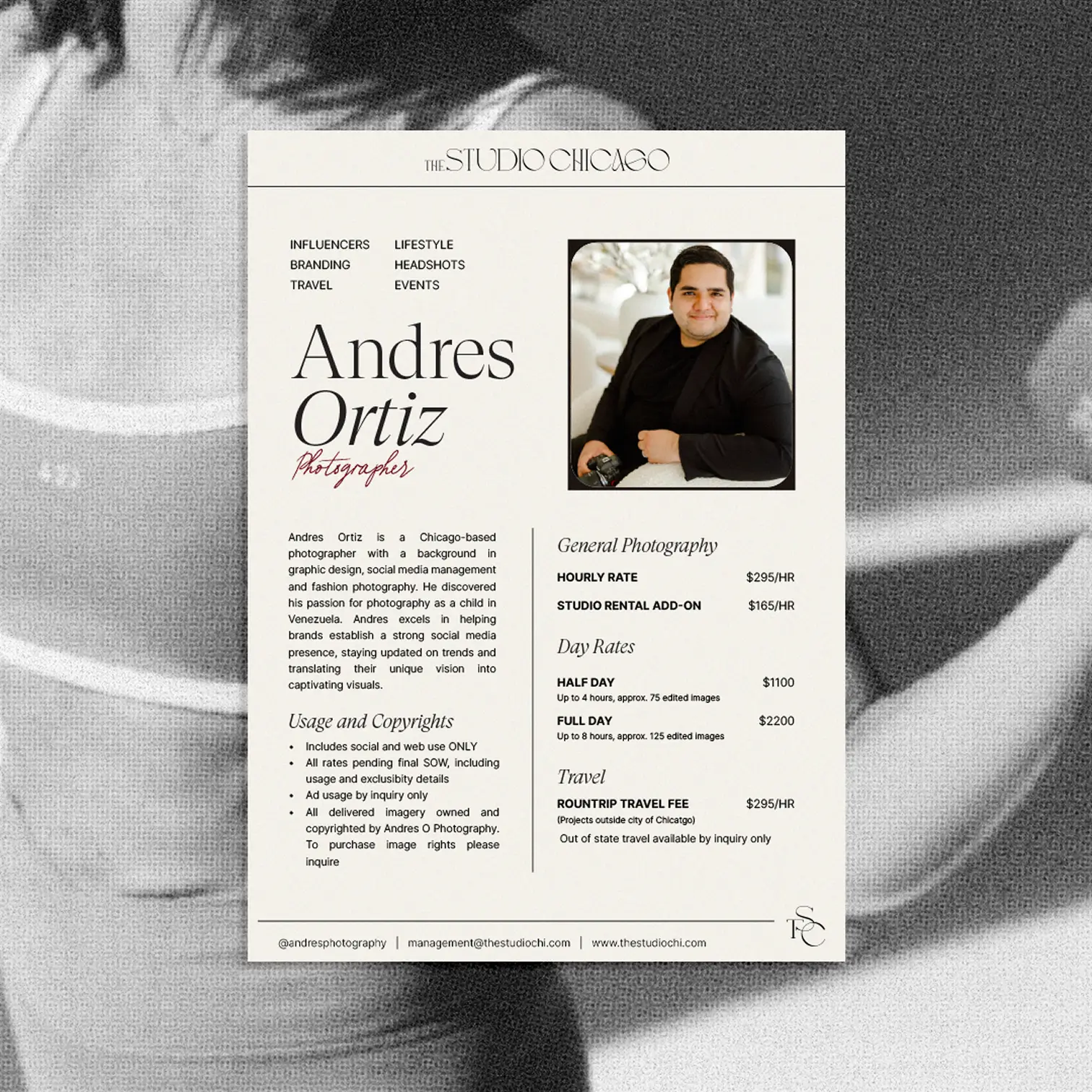
Photography was approached with equal intention. Black and white imagery carries sophistication and innovation through the site, while color photography brings power and inspiration. Together they communicate something important: creativity at The Studio Chicago isn't confined to the loft. The team is ready to create wherever the vision leads.

Creating an Online Ecosystem
The new Studio Chicago website does what the previous one couldn't — it tells the full story. Visitors immediately understand the dual nature of the offering: a world-class studio space and a world-class creative team, available together or independently. The service offerings are clear, the team is visible, and the work speaks for itself.
The uplevel supported continued growth in bookings and brand recognition, and provided the professional foundation the business needed to successfully execute a space expansion. With seasonal consultations built into the partnership, the site continues to grow and adapt as The Studio Chicago does — always current, always elevated, always ready to make the right first impression.
Credits
Videography and Photography
Andres Ortiz
Photography
Hannah Schweiss
Videography
Brandon Boot
Related Projects

Good things, straight to your inbox
Stay in the loop on Isla Luna Studio news, a peek behind the scenes, and more.